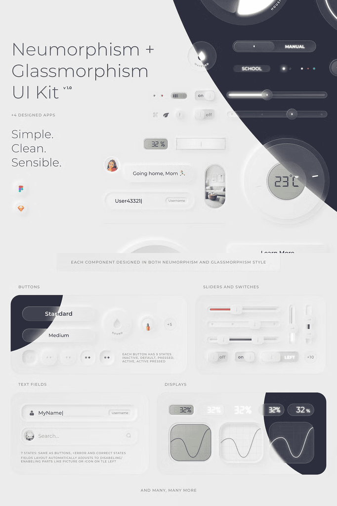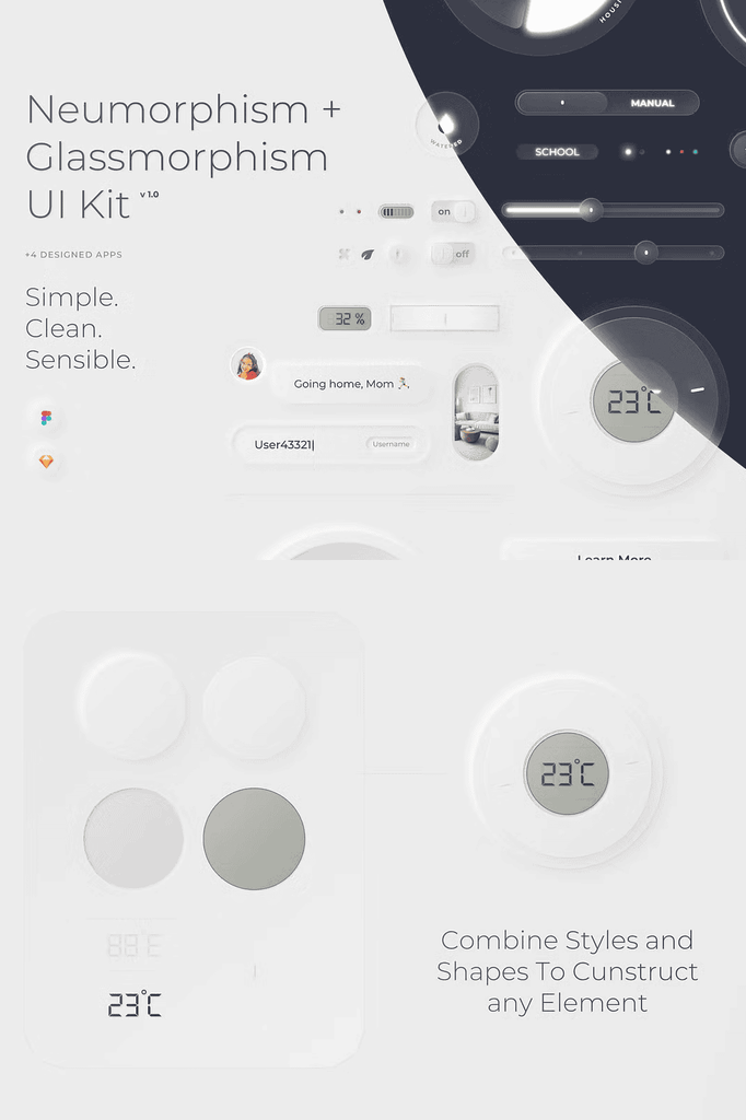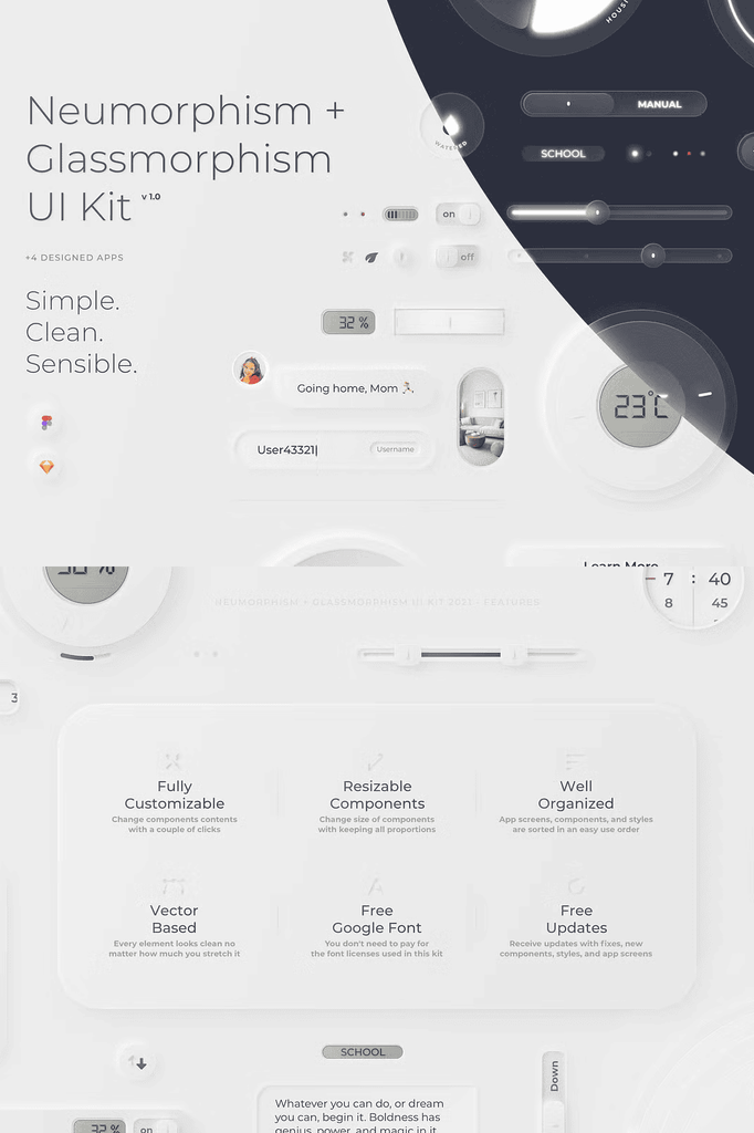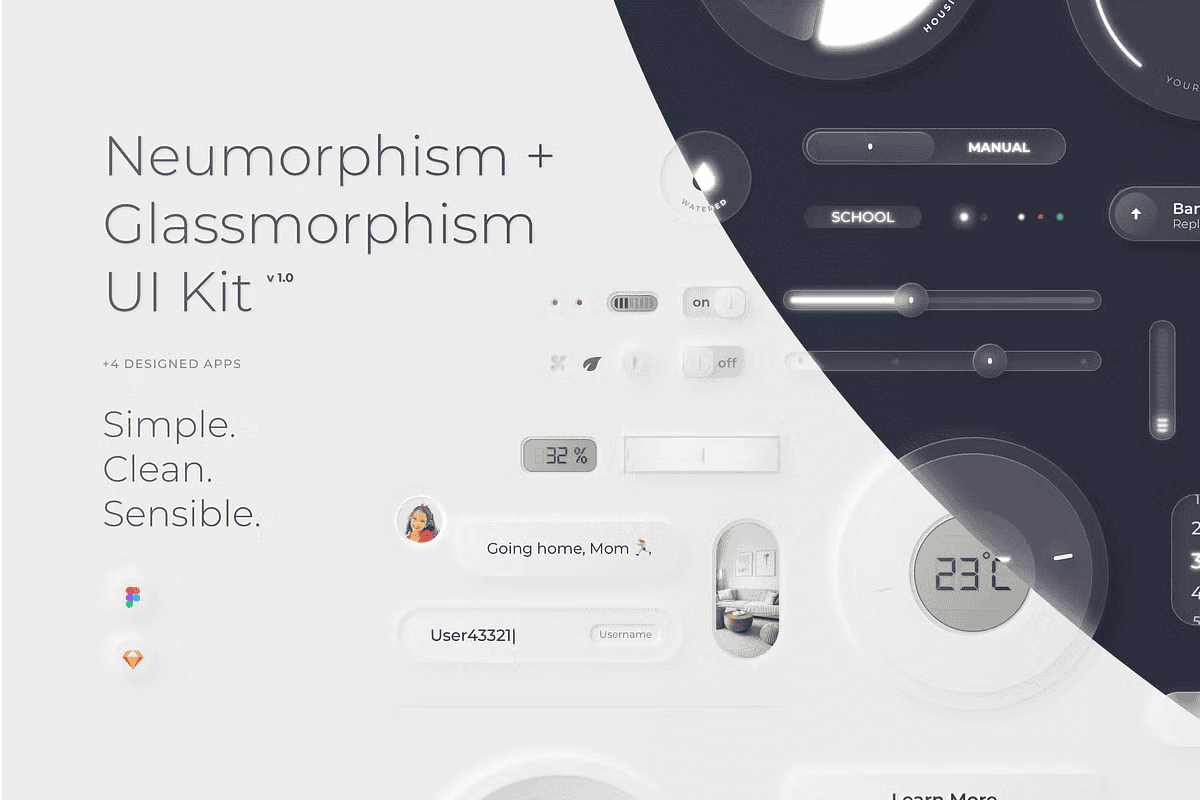
This constructor makes it easy to create mobile UI designs in the style of Neumorphism or Glassmorphism. Following the principle and finding a balance of making it as clean, as simple, and as realistic as possible, the creator spent dozens of hours polishing every shadow, color, and shape.
Neumorph and Glassmorph represent the latest UI trends. With this kit, you can unleash their full potential and create stunning designs that stand out from standard interfaces.
Why This Neumorphic and Glassmorphic UI Kit Leads the Market
This ranks among the biggest Neumorphic and Glassmorphic UI Kits on the market. It delivers Neumorph light components alongside Glassmorph light and dark components. As a result, you gain complete stylistic coverage from one download.
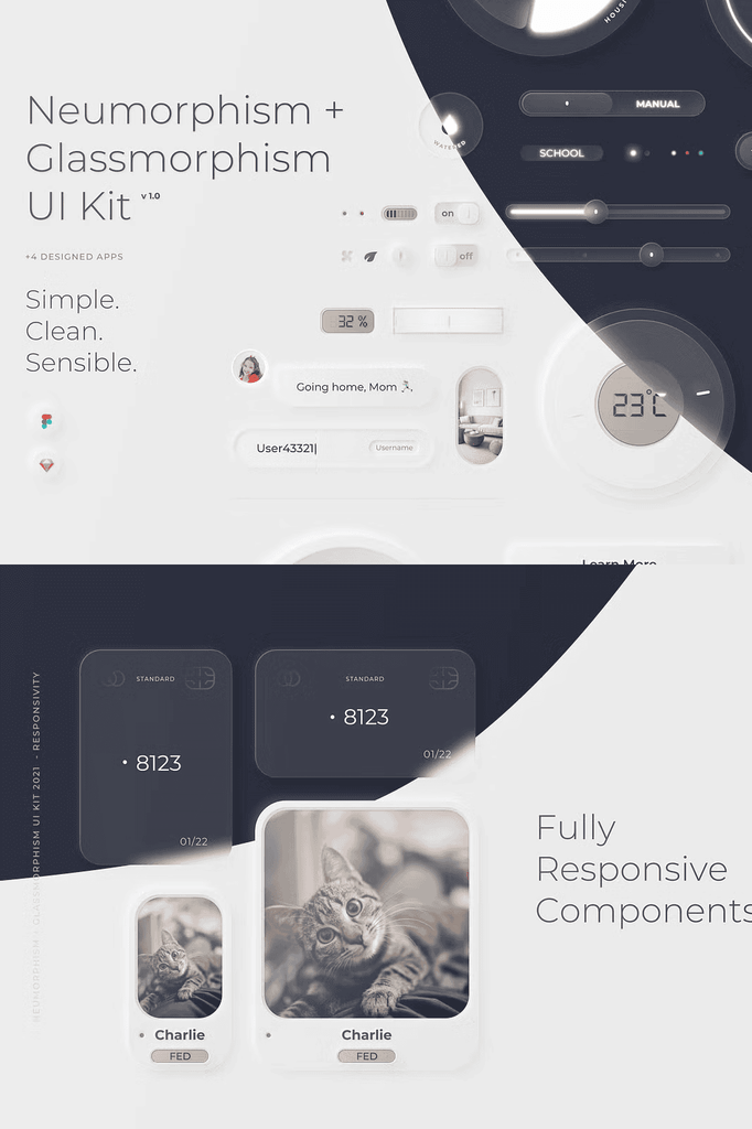
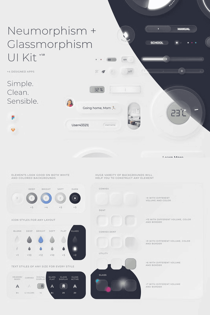
Moreover, every component is fully customizable and adaptive. The kit works with colored and white screen backgrounds. In addition, every component includes designs for all possible states. Consequently, you can build complete, production-ready interfaces without designing elements from scratch.
Key Features of the Neumorphism and Glassmorphism UI Kit
- One of the biggest Neumorphic and Glassmorphic UI Kits on the market
- Neumorph light and Glassmorph light and dark styled components
- Fully customizable and adaptive components
- Works with colored and white screen backgrounds
- Every component includes designs for all possible states
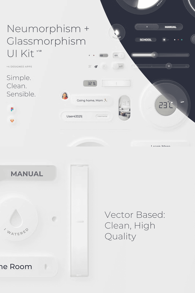
- Every component is vector based
- Backgrounds with different volumes
- Styles usable for desktop designs
- Easy navigation within the file
- Regular updates
Because every element is vector based, you can resize and recolor components without losing quality. Furthermore, the varied background volumes let you match different visual depths and lighting conditions.
What Is Included in This UI Kit
- Special layout grid
- Page with all styles, easy to copy
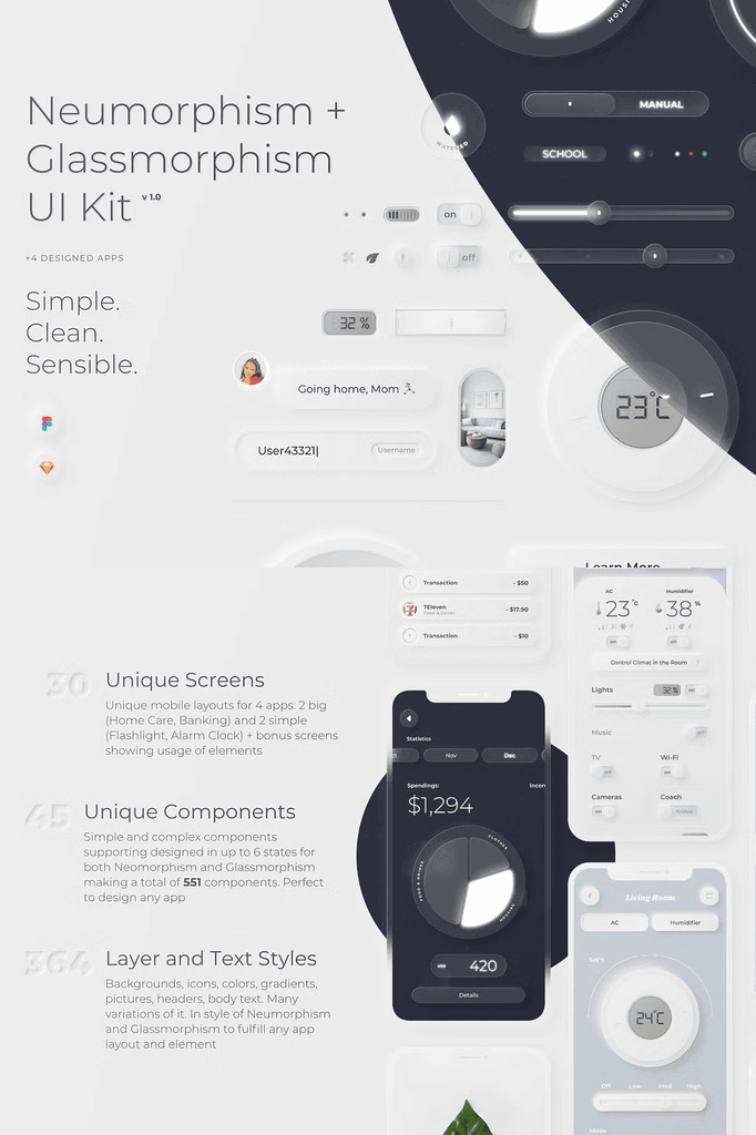
- 551 components total in both Neumorphism and Glassmorphism style
- 364 styles for text and layers
- 30 app screens showing component usage
- Figma file
- Sketch file
The 30 app screens demonstrate real-world component usage, so you can see how elements work together in complete layouts. In addition, the dedicated styles page lets you copy any style instantly and apply it to new designs.
Important Compatibility Note
Please note that you will not be able to use or export this kit in other apps like Illustrator or Adobe XD. The files are built exclusively for Figma and Sketch to preserve component behavior and style integrity.
Who Benefits from This Neumorphic UI Kit
Designers
Save a lot of time. Working on realistic neumorphic elements is genuinely time-consuming. This kit hands you polished components ready for immediate use.
Developers
Save money on a designer. Getting a good neumorphic design for your app typically requires paying an experienced designer decently. This kit delivers that quality upfront.
Product Managers
Save time and money. Getting this kit saves your team far more resources than it costs. As a result, your project moves faster from concept to launch.
Future Updates Planned
- More backgrounds
- Colored buttons
- Photoshop port
These planned additions mean the kit grows more valuable over time. Therefore, your one-time purchase keeps delivering new assets as the collection expands.
Download the Neumorphism and Glassmorphism UI Kit Today
This kit combines 551 components, 364 text and layer styles, 30 app screens, and full Figma and Sketch support in one comprehensive package. It gives designers, developers, and product teams everything needed to build modern, realistic interfaces fast.
Download this Neumorphism and Glassmorphism UI Kit today and start creating mobile UI designs that feel clean, simple, and remarkably realistic. For questions or suggestions, contact fllolmohiber@gmail.com.